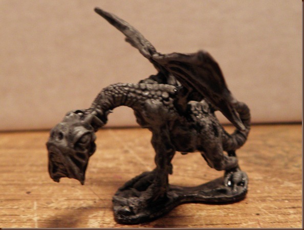
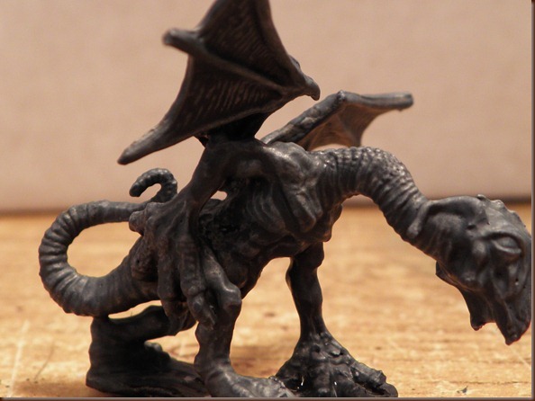
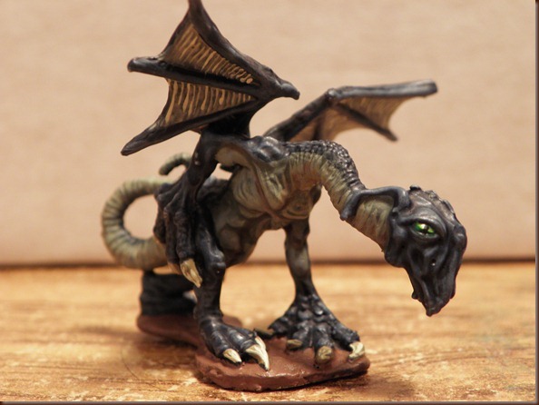
Let me explain what I mean by the title. Sometimes you have models that are essentially the same colour all over, which can present an interesting problem for a painter as you need to create large areas of colour that don’t look flat. In this tutorial I will be using this Jabberwocky miniature to show how you can use washes to create a paintjob that looks visually interesting and naturalistic using a very limited colour palette.
So, I start with a coat of black primer, although white is better is you have it. Then I used a light colour, in this case Fortress Grey, I would recommend using something off-white, not white itself as that will give you a starker finish. Once this was dry I washed the model with Badab Black. What this does is fill in all those crevices so I will be able to see them better in the next stage of the wash. Again, depending on the end result you’re aiming for depends on the colour of wash to use.
It is important to let the model dry thoroughly at this stage or you’re just going to be fighting a losing battle with it. The next thing to do is choose a base colour, this is going to be a shade or so darker than what you want for the midtone. For this mini I went with Fenris Grey. Mix this colour into a wash, you can just use thinner or water but I tend to mix it with one of the GW washes because of how they work. In this case I mixed it with Asurmen Blue. Wash everything with the colour and wait for it to dry. It should leave you with darker recesses and nice highlights.
When you mix up your basecoat wash you want to mix up a lot of it because it will form the backbone of the remaining colours. For the next stage I needed to create a much lighter version of the basecolour so I mixed in Fortress Grey, making sure to leave enough of the original colour behind to work with later. The mix I made was wet, but with enough paint in it for it to stick to the model rather than run. Using this mixture I painted in all the highlights, this included both the underbelly which I wanted lighter and the top of the body too. On the top I picked out mostly edges, like the scales and the muscles and the features on the face. Underneath I blocked out larger areas of flesh that needed to be a lighter tone.
Although this is the “final” highlight stage you don’t need to be super accurate as the wash will take care of a lot of the gradation that needs to take place. Next I mixed Desert Yellow into the basecoat wash colour until I created a wash shade that I liked for the underbelly. Using the original wash colour to do this creates a more unified feel to the model than if I mixed up an entirely different colour, but it really depends on the over all feel that you’re going for. I added more Asurmen Blue to the colour to make sure it was wet enough and applied it to the underbelly, washing right up to where I wanted the underbelly to meet the topside.
Next I washed the lower underside with a lighter mix of the underbelly colour, using Bleached Bone to lightened it. I didn’t wash all the way to the edges this time as I wanted that gradual change from blue to remain intact. The lighter wash will still allow the dark tones beneath to show through so I still washed over the dark recesses, which creates a more natural end result.
I then washed the topside with Asurmen Blue, I could have used the original base colour instead, this would have softened the highlights, but I wanted the harsher feel. Again, don’t be afraid to run the wash on one area right upto and even into the next area, if they are watery enough they should just add a touch of shade rather than completely changing the colour of the area.
Finally I completed the model by adding in the finishing touches. The wings were painted in a similar way to the body, the upperside were painted with a lighter version of the base colour, then washed with the base, then with a layer of Devlan Mud. The under sides were done with Bleached Bone and then washed with Bleached Bone and Gryphonne Sepia. In addition I added a touch of Gryphonne Sepia to the darker areas of the underside just for some extra shade.
The eyes were done using a base of Goblin Green, followed by Goblin Green and Golden Yellow, then a thin stripe of golden yellow. Finally I ran a line of Green Ink along the bottom of the eye and added a thin pupil in black.
And that’s it.
Using the same techniques but different colours I achieved wildly different results with other models.
Well that’s it for this week, I hope that next week I’ll be able to bring you a How Not To Paint Otherworld Eyes of Terror!


Very,very effective, a good tutorial, may try it myself.
ReplyDeleteThanks dude. It works particularly well on lizards and it's easier than wet blending! I'll be using this technique on the Beholder when I get the time to work on it :)
ReplyDeleteI am very keen to give this a go. Will post my results when I do! Thanks for the tip!
ReplyDeleteThat's great! I wish you luck, it's as much about experimentation as anything else, don't be afraid to try different things and see what works for you.
ReplyDelete